Thursday, 20 March 2014

Digital Portrait Assignent


Opposite Emotions

      For this image, I took two picture of my younger cousin dean and layered them together. I also cropped both pictures to focus on the emotions in his face. I wanted to make the image look like I had photographed twins, who we're not feeling the same way. That way the image was contradictory in a way, twins but individuals with separate emotions, opinions, and thoughts.  

Original
Pride

      In this image, I had the opportunity to capture veterans listening to the speaker during our national Flag Day. This day was meant to commemorate our country and many veterans and important individuals visited Lourdes that day. The man's face who is in focus says a lot. I took it as pride, for his country and his service. I had already changed the image to black and white in a previous assignment, so I decided to leave that as is since I felt it really focused on the man's expression. To further centre the attention on the veterans face I cropped the picture in tighter so the remaining wall was no longer a distraction, and heightened the contrast a little more. I also think the grain works well with this image because it coincides with his old age, since the grain makes the photo look old and worn. 

Utopia 

Original

     Finally, for my last image I photographed this grade 12 we used as a model in a trial photo shoot. His skin tone ended up turning out over saturated, so I converted the photo to black and white and adjusted the levels, contrast, and brightness. I also cropped the image using the rule of thirds in tight to his upper body to focus on the expression in his face. I chose this image because I found the focus, lighting and over all quality well done and also liked his pose. 

Wednesday, 26 February 2014

Face Overlay

Nightmares
  For this photo I started by taking textures of blood, scrapped skin, and cuts to use as overlays on my face after I removed the background. I converted every layer to black and white, and added a dark wall background which I burned to give it the vignette effect. The eyes took a lot of time, and was definitely my biggest challenge while creating this image. I used several layers to fill the eyes in black, burned the eyelid area to make it look more natural, and duplicated the refection of the eye so a reflection showed through. Still, the effect was too strong so I changed the mode to screen and adjusted the levels of that difference and I was very happy with the results! After I added the other images and adjusted the way they laid on my skin, changed their modes depending on my desired effect, and erased excess parts so that they blended with my skin.
     I felt I was very successful with what I wanted to do for this image, and I am very happy with the final results. Did I scare you? 
*Note - Mrs. Reidel, just a reminder I already showed you my orginal picture and did not want to post them on my blog.

One With Earth
Inspiration Idea
For my additional image, I took my idea from this photo which I thought was a really interesting concept. I faded the earth in the background so it wasn't taking away from my face because that was my desired focal point for the picture. Then I  took the same picture of the Earth and overlayed it on my face, and changed the mode to multiply. I was having a lot of difficulties finding a way to use the Earth on my face in a way that looked appealing, and using the multiply mode was my best option for a very strong image. 
     Overall I'm fairly happy with the results of this image, but I prefer my first photo much more. 

Wednesday, 19 February 2014

Andy Warhol Style Self Portrait


        For each of my Pop Art photos, I used analogous colours on the colour wheel because after going through several trial and error photos I was happiest with the result of using similar colours that blended well with each other. I wanted to stick with colors that I associated with Andy Warhol's work and were bright and appealing to the eye. Since I have a big grin on my face, I chose colors that I thought matched the happiness of the image to stick with that feeling. To me these four groups of colors remind me of the 70's and I really liked the turn out.  I started with the last photo, using warm shades of yellow and then adding a pop of red to the lips to make them stand out as a focal point in the image. Then I decided to go to the other side of the spectrum, using cool shades of blue. These two out of the four are my favourite because of how bright they are. In the other two photos I used shades of violet and green because they are secondary colors of blue and yellow and I wanted to incorporate more uses of the color theory into my work. 
     As for how I created these images, instead of taking hours to fill in every detail where the black occupied I used layers to fill that entire section of color and changed certain layers blending modes to lighten. This seemed to work really well to save time and used the same sort of process as Andy Warhol did with Silk Screening.The hair in particular turned out really well by doing this in my opinion, and gave lots of depth that wouldn't of been there if I were to just fill it in piece by piece. 
     I decided to leave the shadowing underneath the lip because personally I like it. Many of Warhol's silk screen portraits included shading and I don't think the shading takes away from my image. Although I did try to remove it, I found the lips to look quite odd so I left it as is. 
   Finally I flipped the image by enlarging the background, merging the layers I used to color the threshold, and flipping the duplicate of the new layer I created. I repeated this process with all four images because that was the way I found to be most consistent so my images were identical apart from color variation. 


Original Photo
     As you can see, a lot of changes were made in the process of this assignment to make this photo into the four final images I have now.

Friday, 14 February 2014

Photojournalism - Wrestling Tournament


Photojournalism - Flag Day

Photo #1
     The first photo I chose was of the main speaker, who I managed to get a close up on. I decided to use this image because I thought it's a nice head shot of him, and casts a feeling of seriousness. It reminds me of photos put in newspaper articles about the latest politicians speaking on something important, just as this man was speaking about important subjects to our student audience. I chose to put this image in black and white because it emphasizes the feeling the photo gives and takes away any distraction such as bright colors in the background.


Photo #2
     I chose this photo because it really spoke to me. We see the veterans listening to the speaker, and the man's face who is in focus says a lot. I took it as pride, for his country and his service. I chose to change this photo to black and white as well because it brought out the emotion in the old mans face and although the image was a little out of focus due to how far I zoomed in, I sharpened the photo and upped the contrast so it turned out alright.

Photo #3
    This last photo I chose also represented pride to me. I kept in color because the blues of the speakers uniform and the red of the maple leaf in the Canadian flag stood out. They really bring out what Flag Day meant for Lourdes this year, commemorating our national service and veterans who served for us in the war.

    I really enjoyed taking these photos and am pleased with the shots I took. This assignment opened my eyes to how interesting photojournalism can be!


Tuesday, 11 February 2014

Photojournalism Ethics

Response Questions

1.)     A good photographer is honest. Yes it is okay to move objects interfering with the shot, such as a chair in the way of you taking a great picture of a spokesperson. It becomes unacceptable when instead of taking something out of the shot, you add an object into the scene. This refers to staging because the shot is altered to change the meaning. For example, the scenario "It All Began With A Mouse" was an unaltered photograph of a child's toy left in ruble. See figure 1.
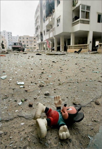
Figure 1
      This photograph raised lots of attention for its meaning, how war had effected the children living there. Soon after many people posted pictures very similar to the original shot, staging children's toys in garbage and rubble. These photos portrayed the same meaning, but were fake. Photojournalism represents true events, so altering the shot in my opinion is unethical because its lying to your audience.
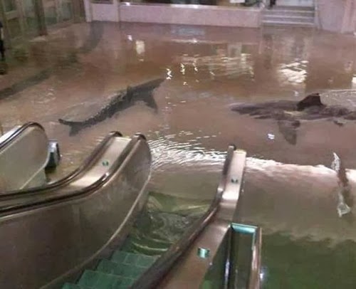
Figure 2
2.)    Digital photo manipulation in my opinion is another form of unethical photojournalism. Using any form of computer software, such as Photoshop to alter photos meant to show real events is digital photo manipulation. Figure 2 is an example of how someone took several photos and merged them together to create a new image. In photojournalism, it is our duty to not alter photos so that they mislead the public and label digitally altered photos as photo illustrations. We have to be accurate in what our photo represents, and honest about the way that photo came to be. Providing context with Figure 2 informing the audience that this photo was alter, would make it okay to post. 

3.)     With new technology advances accessible to the public for photography, as photojournalists we must treat all subjects we are photographing with respect. In most cases, I think it is okay to take pictures of the general public for journalistic or artistic purposes. Respect for others' privacy tells me that the fact that the person doesn't know you're doing it from a distance doesn't really change anything, so in my opinion if you are able to ask the person or group of people you are photographing for their permission it should be done. I believe intrusion is only ethical given the right amount of respect and dignity to the subject. Compassion should be given to those who are victims to the event being photographed, and be put into consideration that they might not want to have photos published of them. Although respect is needed in any tough situation being photographed, if intruding has a justifiable reason why the public needs to see the images then is it considered acceptable.