Thursday 29 May 2014

Student Vote Poster Assignment

Student Vote Poster
Original
      For this assignment I was inspired to do a peace symbol with my hands from the poster I have bellow, because I liked the concept of how your vote can create peace for our country by choosing the right representative to lead our government. In the poster that was my inspiration the hand is depicted through a sketch, so I wanted to modify that idea by taking a photo of an actual hand and change it into that same kind of black and white.
   
Inspiration
     My concept, as I mentioned above, is that each vote can make a difference towards a peaceful and just province. I used bold uppercase letters to grab the viewers attention, as well as the the slanted white strips and the focal point of the large peace sign which makes out the word vote. Vote is the largest word in my poster because my goal is to encourage students to vote for someone, above everything else. I chose to keep the entire poster in black and white because it stands out as being bold, but also represents balance and power that connects to the election because my poster is meant to encourage voting but not for any specific party. I decided to add the Ontario symbol because it reminds the viewers that they are voting for Ontario's representatives, not Canada's government, and used this specific font for all the words in my poster because it reminded me of Vogue which I thought would appeal to the teen audience my poster's trying to draw attention to.

Monday 26 May 2014

Macro Photography

Rosebud of White
Texture
Before B&W
Original

      For my first image I took this photo of a rose because of the many interpretations of what roses symbolizes, providing me many options for editing to create a photograph with depth and meaning.

      I cropped the picture in closer to the rose which is in focus using the rule of thirds composition, keeping the focal point off centre, because I wanted to remove the rose that was out of focus to remove distractions from the focal point. I kept the leaf which was out of focus though because I liked the depth it added to the photograph and how it draws the viewers attention into the focused rose. 

           I adjusted the contrast and saturation of the image to take away distractions of the wall in the background but then decided the photo was oversaturated and no longer crisp, so I removed the saturation of the image completely leaving a black and white photograph. I think the black and white creates a more powerful image because there is no distractions from the bright colors.

     My concept for this image is love and loss because the rose is often interpreted as a symbol of love, but the black and white symbolizes emptiness and unhappiness. The image's design element is texture because there is various rough and soft textures in the photo, such as the soft rose petals and the rough texture of the leaves and thorns.


Serenity
Color
Original
     For my second image I took a picture of this daisy but the photo was taken in a very wide crop, so the first thing I did was crop it very tight to the flower using the rule of thirds to keep the focal point to the left of the image. Then I adjusted the sharpness and contrast of the picture so that all the details in the petals and the stamen would really pop and draw attention. After I used the clone stamp tool to remove small specs and imperfections from the petals, and used a separate layer to blur the background with the gaussian blur filter. Finally I adjusted the saturation of the photo to brighten the colours further.

     I decided this image's design was color because of the vibrant contrast of whites, yellows, and greens that the viewer notices right away. I think the colours, in combination with the cropping using the rule of thirds makes this photo stand out in particular because of that pop.


In Bloom
Lines
     For my final image I chose this because it is especially macro because of the tight crop. I cropped the photo this far in because I found with the original there was no on point for the viewer to focus on where as with the new cropping the focal point is the stamens poking out of the beautiful yellow blossom.  I also adjusted the contrast, brightness, and saturation. Finally I removed specs from the petals from this flower in the bloom as well.
Original
    I chose lines to be the design element in this photo because of the lines in the stamens which are the focal point of the image.

Friday 9 May 2014

Photo Restoration

Restoration

Original


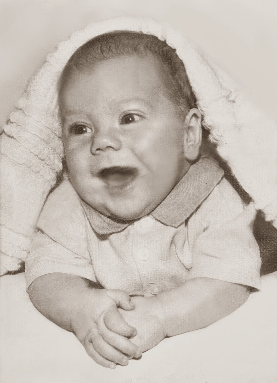
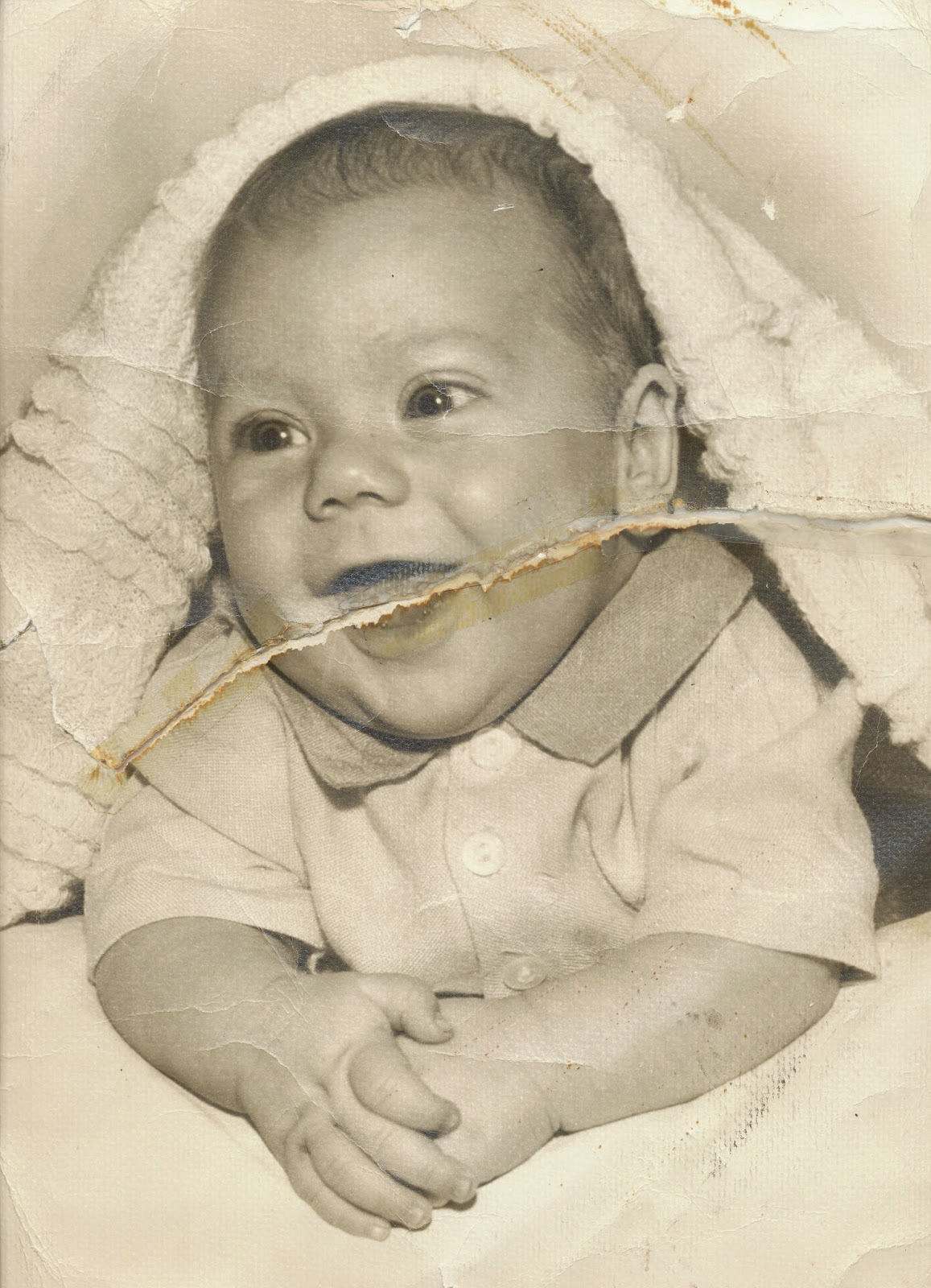
     I chose this photo, option #3, because I thought the tears and bends in the photograph would be quite a challenge to restore.
     I started restoring the image of the baby by changing the image to black and white. By removing the saturation in the sepia tones it took away the vintage appear to the photo and I could then start retouching and fixing the tears and abrasions in the picture.
     I then created a new layer to begin restoring the image by sampling a near by area of the tear along the baby's mouth and clone stamping away the rip. I removed this tear first because it was the largest imperfection in the photo, so tackling the largest task first was a priority for me.
     With another layer I repeated the process of sampling a near by area and clone stamping imperfections and tears or bends out of the image along the baby's arms, shirt, and face. I sampled near by areas to clone stamp the abrasions out because it replicates the skin or clothing tone and texture the best for that specific spot.
     Finally, I clone stamped and painted with grey tones the background and foreground beneath the baby's arms almost entirely out to remove the remaining stains, tears, and bends and adjusted the lighting and contrast to brighten the image.
     Overall, I am fairly happy with my results, especially in the difficult task to restore the baby's mouth, but I was disappointed to see that my final restoration does not show up in true black and white tones on this website.


Thursday 1 May 2014

Composite Images

Voyager
     For this assignment I really wanted to create depth and portray emotion through my images as opposed to having a more contemporary composite image which throws many different pieces together that don't always have real significance to the concept or depiction. 
    I think my first image portrays just what I desired. My concept for the composite was to represent a road of journey thats long and strenuous but worthwhile in the end. This journey is represented in my image by the mountainous trail to which the girl in the foreground is about to take and the orange and yellow sky represents hope and clarity of what's beyond the fog as the sun rises. 


Midnight Mist
Sweet Noel


Monday 28 April 2014

Composite Image Critique


Ice Age Premonition
     George Grie was born May 14, 1962 and is a Russian-Canadian artist known for his outstanding digital surrealism artwork. George is known for his numerous amounts of 2D and 3D images as well as matte painting artwork. His detailed digital art captures dreamlike worlds, which he calls neosurrealism. This form of surrealism is a combination of dreams and fantasies he brings to life through composite images.
    I think he composed this image by taking several images of clouds and water to create the background, used pictures of buildings and icebergs to create the basis of the foreground focal point, and then added little details like the stair case, cavern, and birds. These little details, in conjunction with how he changed the tones of the multiple images so the overall effect is very monochromatic, is what I think really makes the image so outstanding. His choice of of these dark blue and grey tones in his images bring a cold and mysterious feeling to the viewer. You could stare at a picture of an ice cube all day long and not have any chills but George's image makes an impact on his viewers through these somber, unworldly composite images. For those reasons I think his result is very pleasing.
  

Thursday 24 April 2014

Digital Painting

Mechanism
      In my first digital abstract painting named "Mechanism" I used a monochromatic color scheme of shades of green to add dimension and create a 3D futuristic look. The image combines harmony in the monochromatic greens with a sharp contrast of dark and light shades and soft and hard shapes. The greens are used to ignite excitement in the viewers as hope of the future holds unforeseen promises.
 I used a range of digital painting techniques such as designing the shapes to create the focal point which is incorporated into the rule of thirds by being off to the left of the image as well as using gradients and various brushes to create the painting. The concept of this image was to create a modern, cutting edge piece so the focal point can be taken literally as "cutting edge" since the shapes that create it are extremely sharp. The focal point draws your attention to the left side of the image and the gradient guides the viewer's eyes straight to the shape.
Eye of the Beholder
     In this digital painting named "Eye of the Beholder" I took inspiration from the image to the left which I found on a digital painting website. Instead of over painting an eye I started from scratch and painted the entire eye using a wide variety of brushes and tones of colour, especially in the skin. The image captures intermediate colors of blue-violet and tones of yellow-orange which are soft variations of complimentary colours. The focal point is the detailed iris and pupil of the eye which pull the viewers attention to the middle of the image. I had originally finished with the image on the right but decided to alter and deepen the colors to make a bigger impact upon first glance and overall make                                                                              the digital painting look more realistic. 
     I decided on changing the color of the eye to a deep blue because it represents feelings of disappointment and grief which eyes can reveal so well through emotion. People say an image is worth a thousand words, and I believe the emotion an eye holds is worth just the same. This digital painting was definitely the most time consuming and difficult out of the 3 I completed but I'm very pleased with the result.


Depth of Mind
       I chose to do another abstract image for my final digital painting entitled "Depth of Mind", which uses a range of monochromatic and analogous colours that blend together harmoniously. The choice of deep purples and blues represent the deeper, distraught side of the mind and spirit that fades to the focal point of the brighter light tones of blue which represent the relaxation of the mind. The focal point is the representation of this calm state because its the relief of stress which surrounds our lives in the deep blue colours. I considered the rule of thirds by having the focal point slightly off centre and on a diagonal to signify that the journey to peace of mind is askew and not always perfect. The orbs of color reinforce this symbolization through pieces which are faded, that represents parts of our life which shouldn't be focused on or be worried about, and pieces which are clear and in focus, that represent the important things in life that leave us content and should be focused on.  

50 Shade of Carefree
     I ended up doing another version of  "Depth of Mind" entitled "50 Shades of Carefree" which follows along with the symbolism of states of mind. I chose this title because the rainbow of bright colours represents a child like cheerfulness and incorporates more in focus orbs which signify a mind free of worries. 

Note - the posting is giving me difficulties and that is why I wasn't able to have my write up posted on time. The text editing also won't let me disable highlighting which is very frustrating so I apologize for any troubles you may having reading my write up.

Tuesday 15 April 2014

Our Lady Of Lourdes Poetry Anthology Cover Design

     My cover design should be selected for the Lourdes Poetry Anthology because it represents the ideas of our students put into thoughts, expression, and poetry. The lightbulb represents the creative minds that Lourdes puts on showcase through the book. The black and white adds drama and mystery while the font ties in old handwriting in a digitally fabricated image.
Original
I also added grain to the picture to give the image more depth and texture and made the font of each set of words a slightly different size to make a larger impact. Overall I think my design cover should be picked because the combination of simpicity and represents the ideas of creative students at Lourdes